Monday 14 March 2011

Task 2 Final Piece

After doing some sketches and ideas in my sketchbook I have finally finished my final piece for part 2 of this brief.

Below are some photos of the process and the final piece itself.


This pile of rips and offcuts from Task 1 was used to create the word 'Paper' seen in the poster.


The word paper made from paper cuttings.


I cut the letters O.F from a sketch book and folded them up to cast a shadow.
This never actually made the final piece as I was happy with just having the 100 Years and Paper made from paper. I wanted a clean cut design to my poster and the OF i had created wasn't fitting with the rest of the poster.


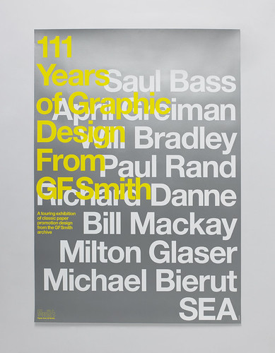
The above image is my final poster. The '100 YRS' is a small piece of folded paper photographed, put into photoshop and duplicated to build up text. After putting all the type elements into the canvas I arranged them onto a background which (although is barely able to be seen) is my sculpture from Task 1 with the numbers 100 hanging from the bottom of it. I also added the GF Smith logo and overlayed a crumpled paper texture to it. After finally settling with the arrangement of text I added some type to the bottom, created a vertical border and added a gradient overlay for effect. 

Task 2 Research

For the poster part of this project I decided to do some research and look at paper typography and paper posters, aswell as a pre-existing GF Smith poster.


This is by Yulia Brodskaya. It is a very intricate design which primarily consists of coiled strips of paper.


This is an even more intricate piece by Julene Harrison. This piece is soley cut out text from a sheet of paper. I could look at doing something similar for my GF Smith poster.


Another similar piece by Julene Harrison.


This is a very interesting piece of type that says Look Into The Sun. It is very simple but also very effective. I could possibly incorporate this into my work through cutting GF Smith out of the words 100 Years Of.


Photo


This is a very simple concept that to me is paper based typography at its best, and rawest. I personally would definitely like to do some sort of type face work with strips of paper in my final poster - as I find despite it not being as intricate - it is easier to read and therefore more informative.


I really like this typography, and I could do something similar myself - however I'm not sure how I would incorporate this style of paper typography into my final poster.


Similar to the first image of this post - strips of paper shaped into text.


This is an image for the Paper Talks exhibition that was on at the Design Museum. 
Like my brief, it uses paper shaped typography, but in a very simple form, of just 3D Paper letters.


This is a GF Smith poster celebrating 111 Years of GF Smith Graphic Design.

Task 2: 100 Years of GF Smith

Task 2 is to create a poster advertising 100 Years of GF Smith at the Design Museum.
For this I will need to look at paper based posters and typography for inspiration.

Final 3D Sculpture

I have completed my final 3D Sculpture and here are some pictures from the process of it.


I started off with a cutout of a shape that resembled that of a bird. From here I then went onto draw out numerous 'birds' and cut them out, ready to be fixed together.


Here are some of the shapes left in my sketchbook post-cutting. I took all the cut-outs, made the required slits in them and fixed them together. 


I used thread to aid in the spiraling of it for the final sculpture.
Pictures of my final finished piece can be seen below.


Final piece thoughts

I have thought for quite a while about how my final piece will take shape.

Taking inspiration from flocks of birds I have decided to go with a cutout of a shape that resembles that of a bird, but at the same time not too similar to that of a bird, so that the sculpture looks like a spiral shape, rather than just a collection of bird cut-outs.

As I just said, I'm hoping for the sculpture to be a spiral shape.

I've done some sketches in my sketchbook of the possible 'bird' shapes, the overall sculpture look, and how I will go about joining one shape to another.

Paper artists research

To help with my project I have researched into a few paper artists and their works.
Naturally I started with Richard Sweeney.

Richard Sweeney uses a variety of techniques to create paper sculptures, whether it be pleating, folding, wet folding or surface modulation.
Here are a few of his works I've selected that I personally think are the most relevant to the theme and my own personal taste.


Next I took at a look at Ingrid Siliakus, who creates intricate paper building sculptures, which do contain a few elements of repetition.


I next looked at Brian Chan, who creates insect sculptures - I feel this ties in with me looking at birds, fishes and so on, so here are a few images of some of his works.


Hermit Crab by Brian Chan 10 Most Amazing Origami in the World


Repetition research

I decided it would be best if I did some research and found repetitive patterns in the world, which could be used for inspiration for my final piece.


A flock of doves: this ties in with one of my earlier test sculptures. I think creating a bird-like shape and repeating it to symbolise some sort of flock or group would make for an interesting final piece.


These are just a few simple images of plant repetition. Indeed they are simple but the repetition is very effective and I think taking inspiration from these types of images and structures could prove to create a good 3D sculpture.

designer white coat hangers

Some designer coat hangers - although not a natural form, I think the shape created by the coat hangers is brilliant, and really gives a flowing feel. It is also a perfect example of how repetition of one structure can create other images. For example, here I see some sort of spine with vertebrae jutting off. The plain white colouring also helps me to imagine this sort of sculpture in paper.


Just a simple image of repeated wooden posts in the sea.


On the subject of water I decided to research some waves, as I think that due to the nature of paper, wave like shapes could be created easily through curling the paper or scoring or cutting it, twisting it an then letting it fall. I also moved from waves onto ripples, which are a simple circular repetition, which could be reproduced through pleating.


From my earlier post about flocks of birds being a very good source of natural repetition, I decided to do research into it and I have found that flocks of starlings (see below) are the best source of this. In formation they twist and repeat to create incredible shapes, that I think could have quite an impact on my final piece.


I also took the time to have a look at schools of fishes, quite a similar sort of approach as the flocks of birds.