
This is by Yulia Brodskaya. It is a very intricate design which primarily consists of coiled strips of paper.

This is an even more intricate piece by Julene Harrison. This piece is soley cut out text from a sheet of paper. I could look at doing something similar for my GF Smith poster.

Another similar piece by Julene Harrison.

This is a very interesting piece of type that says Look Into The Sun. It is very simple but also very effective. I could possibly incorporate this into my work through cutting GF Smith out of the words 100 Years Of.

This is a very simple concept that to me is paper based typography at its best, and rawest. I personally would definitely like to do some sort of type face work with strips of paper in my final poster - as I find despite it not being as intricate - it is easier to read and therefore more informative.

I really like this typography, and I could do something similar myself - however I'm not sure how I would incorporate this style of paper typography into my final poster.

Similar to the first image of this post - strips of paper shaped into text.

This is an image for the Paper Talks exhibition that was on at the Design Museum.
Like my brief, it uses paper shaped typography, but in a very simple form, of just 3D Paper letters.
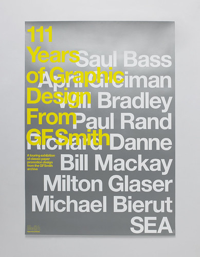
This is a GF Smith poster celebrating 111 Years of GF Smith Graphic Design.
No comments:
Post a Comment